 Map")
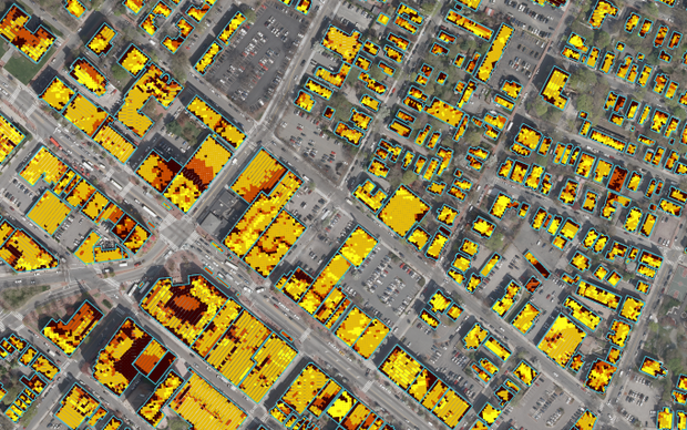
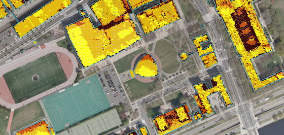
 Mapping the Potential for Solar Power On Every RoofOct 17, 2012 - EMILY BADGER - citylab.com Nearly every square meter of rooftop in Cambridge, Massachusetts, has now been evaluated for its suitability to host solar panels. From the sun’s point of view, all of this means that Cambridge looks
about like the aerial image above. The gold dots are the solar sweet spots,
the brown ones are more or less untouchable. The image comes from a new mapping
tool built by MIT’s Sustainable Design Lab and the Boston design firm
Modern Development Studio. They’ve mashed together some pretty remarkable
datasets about Cambridge to model the solar potential of just about every
square meter of rooftop space in the city (literally, each of those dots
represents one square meter). And the model they’ve developed could
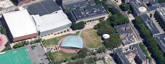
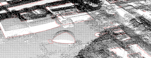
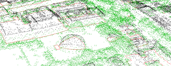
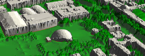
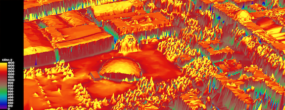
potentially give us the same information about every surface on the planet. This project assumes that we will one day be making decisions about where to put this stuff at the community level rather than the household one. “Right now it’s a bit about me, me, me,” Reinhart says, light-heartedly. “How do I get the most money?” This map illustrates that just because you want to be that guy on the block with solar panels doesn’t mean your house is the best place to put them. MIT came up with all of this leveraging a couple of giant datasets with fine-tuned algorithms. The model relies upon hourly solar radiation data collected at nearby Logan International Airport (data that measures, in effect, how much sun the city gets in this climate), as well as on Light Detection and Ranging (LIDAR) data previously collected in an aerial flyover of the city. LIDAR data, which captures how far each treetop or roof is from the ground, is commonly used to make three-dimensional models of cities (or to measure things like tree cover). In the case of Cambridge, that LIDAR data contained 126 million individual data points. To illustrate what this looks like, this is an aerial photo of MIT’s campus and Kresge Auditorium:
In all, Cambridge is particularly solar-friendly because most of its buildings are of about the same height. A similar picture of Manhattan would look dramatically different, with taller buildings crowding out the solar potential of smaller ones. As Reinhart hopes, similar tools should come soon to other cities, too. All images courtesy of MIT's Sustainable Design Lab and Modern Development Studio.
|
Email this page to a friend
If you speak another language fluently and you liked this page, make
a contribution by translating
it! For additional translations check out FreeTranslation.com
(Voor vertaling van Engels tot Nederlands)
(For oversettelse fra Engelsk til Norsk)
(Для дополнительных
переводов проверяют
FreeTranslation.com )